Josué Molina
Data Analyst | Musician
Email me
View My LinkedIn Profile
Data Visualization: Massachusetts Education Data
To see a 5-minute video of me sharing this project, go to this link. To see the dashboard on Tableau Public, click here.
What’s the best way to measure school effectiveness? Maybe it’s standardized test scores. Maybe student performance in STEM fields is more important than involvement in fine arts, or some other metric. As both a musician and a mathematician, I believe that there should be multiple metrics for determining student performance, but I must agree that performance in mathematics is rather crucial. It is the Queen of the Sciences, after all. In this project, I visualized Massachusetts education data using Tableau. Besides performance on the statewide standardized math test, I observed other metrics for school effectiveness, including college attendance.
This project is important because education is the bedrock of society - if the next generation is not trained well, we will all suffer. It is also important because sometimes there are issues or obstacles that don’t cross our mind when we first think about why struggles happen. Looking at the data can cut through our blindspots. In this project, I discovered that:
- 37 Massachusetts schools have a graduation rate under 50%.
- Only 19% of differences in the share of graduates that attend college can be explained by average class size.
- Only 4 districts in Massachusetts have an average math MCAS score of at least 50%.
Exploring data visualization outside of Microsoft Excel was pretty fascinating. Keep reading to see how I uncovered these insights!
The Dataset
The Dataset was obtained from the Massachusetts Department of Education website from 2017, and it combines multiple reports. The reports can be found here, and the dataset can be found here.
Analysis
Graduation Percentage
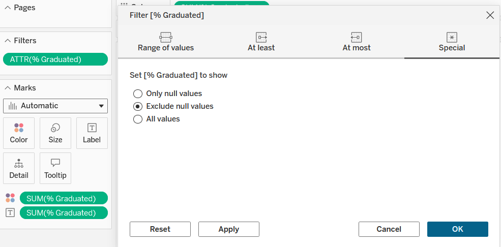
Graduation percentage is one of the main measures of education success; naturally, it was the first metric observed. I created a bar chart showing graduation percentage by school. Some schools had null values, so I created a filter which eliminated those data points:
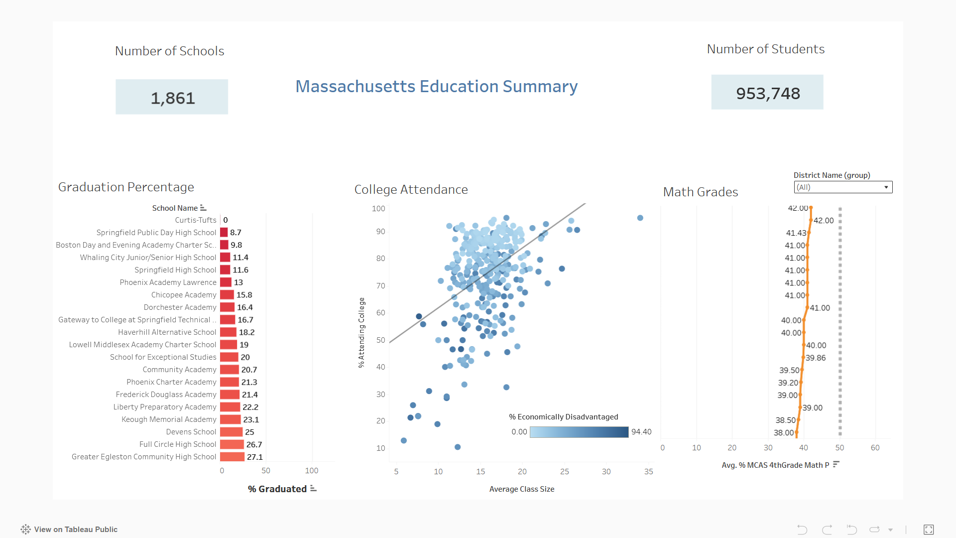
I then sorted the bars in ascending order, created a color gradient from red to green, and added the percentage value at the end of each bar. Each of these choices helps the stakeholder easily see which schools are meeting a majority graduation percentage and which schools are struggling the most or doing the best. This graph also shows that there are 37 Massachusetts schools with graduation rates under 50%, which is useful for the department to know.
College Attendance
The next metric I examined was the share of graduates that attended college. I examined this alongside class size, and made a scatterplot. There was not a strong correlation - with an R squared value of about 19%, only 19% of variance in share of college attendees could be explained by class size. I added a third dimension, though, which is a very neat thing to do in Excel and add to scatterplots. I examined the share of students that are economically disadvantaged. To display this, I used a color gradient with light blue signaling a lower percentage and a dark blue signaling a higher percentage. This is what the chart looked like:
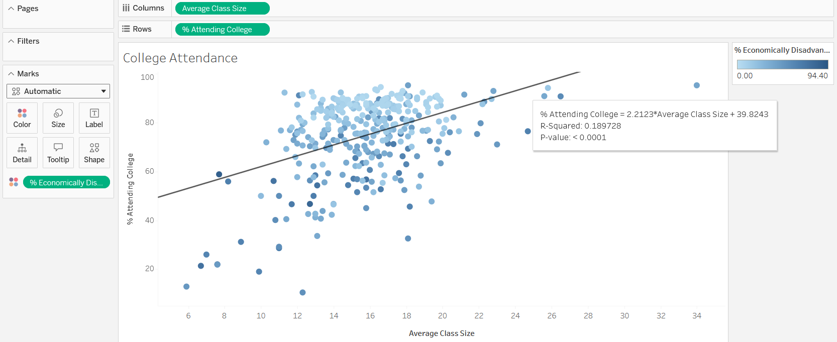
It is clear that there is a higher concentration of non-disadvantaged schools above the line of best fit than below. This makes sense, as economically disadvantaged students typically have more barriers to college entrance, whether it is economic or academic.
Mathematics Performance
I observed performance of students (by district) on the MCAS mathematics exam, which is a standardized test used in Massachusetts meant to measure mathematics proficiency. I experimented with a line chart in this case - although I traditionally only use line charts for time series charts, it was pretty interesting to use it for other visualizations. In this case, I put districts on the vertical axis and average score on the MCAS on the horizontal axis. In order to highlight relevant trends, I created a reference line at the 50% mark to show which schools have an average mark above or below this mark. I then grouped districts by that trend and formatted them accordingly:
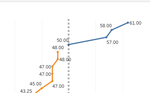
In this way, I saw that only 4 districts met or surpassed the 50% average score mark. I also added a dropdown filter so that a stakeholder could choose to only see districts in one of the two categories:
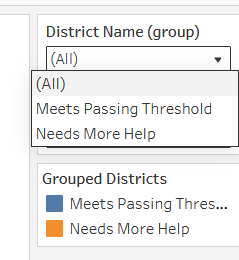
I think the line chart does an excellent job of showing relative differences - in this case, a “steep” line means that two districts have about the same average score, while a “shallow” line connecting two districts means that there is a larger gap.
KPIs
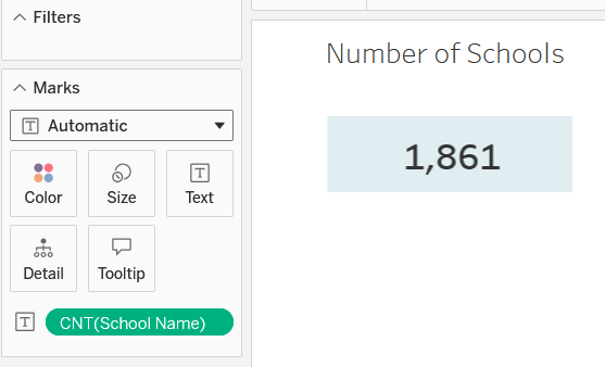
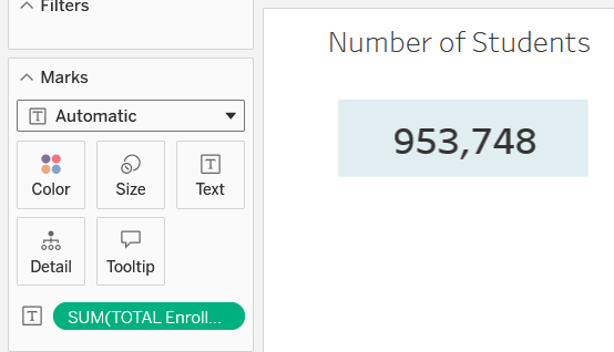
Last of all, I practiced adding KPIs to the dashboard by adding a text element for an attribute and using the count aggregation. I found the total number of schools and the total number of students this way. To make the numbers bigger, I used the annotation feature so that I could add a box as well. I think next time I will try editing the text directly, but it was good to practice other ways of doing things. The result was this:
Final Dashboard
I combined all these charts and KPIs into the final dashboard:
Takeaways
The first graph clearly shows which schools are struggling the most with graduation rates. While most schools have most of their students graduate, it is still alarming to see several schools with a rate below 25%. The second chart is excellent at reminding stakeholders about the importance of addressing socioeconomic challenges in particular schools and districts. I think a great step forward would be to create programs and funding that can encourage students in economically disadvantaged situations to be more informed about scholarship opportunities and the benefits of a college education. The last chart was the most alarming - with only a few districts having an average MCAS score of at least 50%, it is clear that mathematics is a struggle for students in Massachusetts. As in the college attendance case, it is worth considering programs that will improve math performance, whether it’s educational software or increased mentoring.
Thanks for Reading!
This project was really fun. I can’t wait to learn more about Tableau and data visualization! Connect with me on LinkedIn and feel free to share any feedback.